
A Moon Shaped Pool
Radiohead, A Moon Shaped Pool, is a hypothetical rebrand
of the A Moon Shaped Pool album released by the English rockband
Radiohead. This was the first rebranding project that I completed as
a graphic designer at ArtCenter College of Design in the masters
program, and it was extremely eye-opening. From the deep-dive into
a new genre of music to the abstract photography that emerged, the
album burned a lasting impression into the way in which design solutions
were previously interpreted.
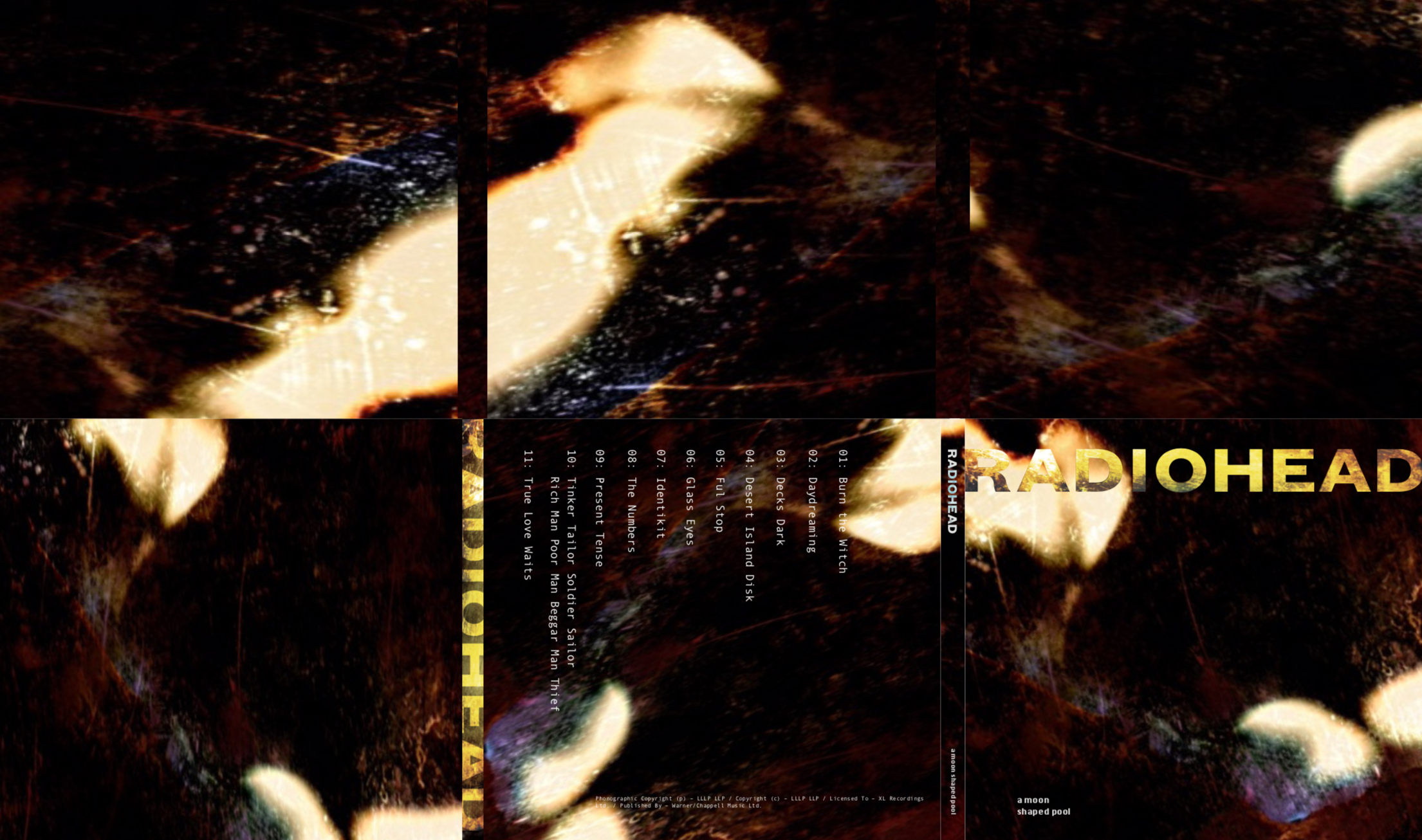
Vinyl, Album,
& CD Covers
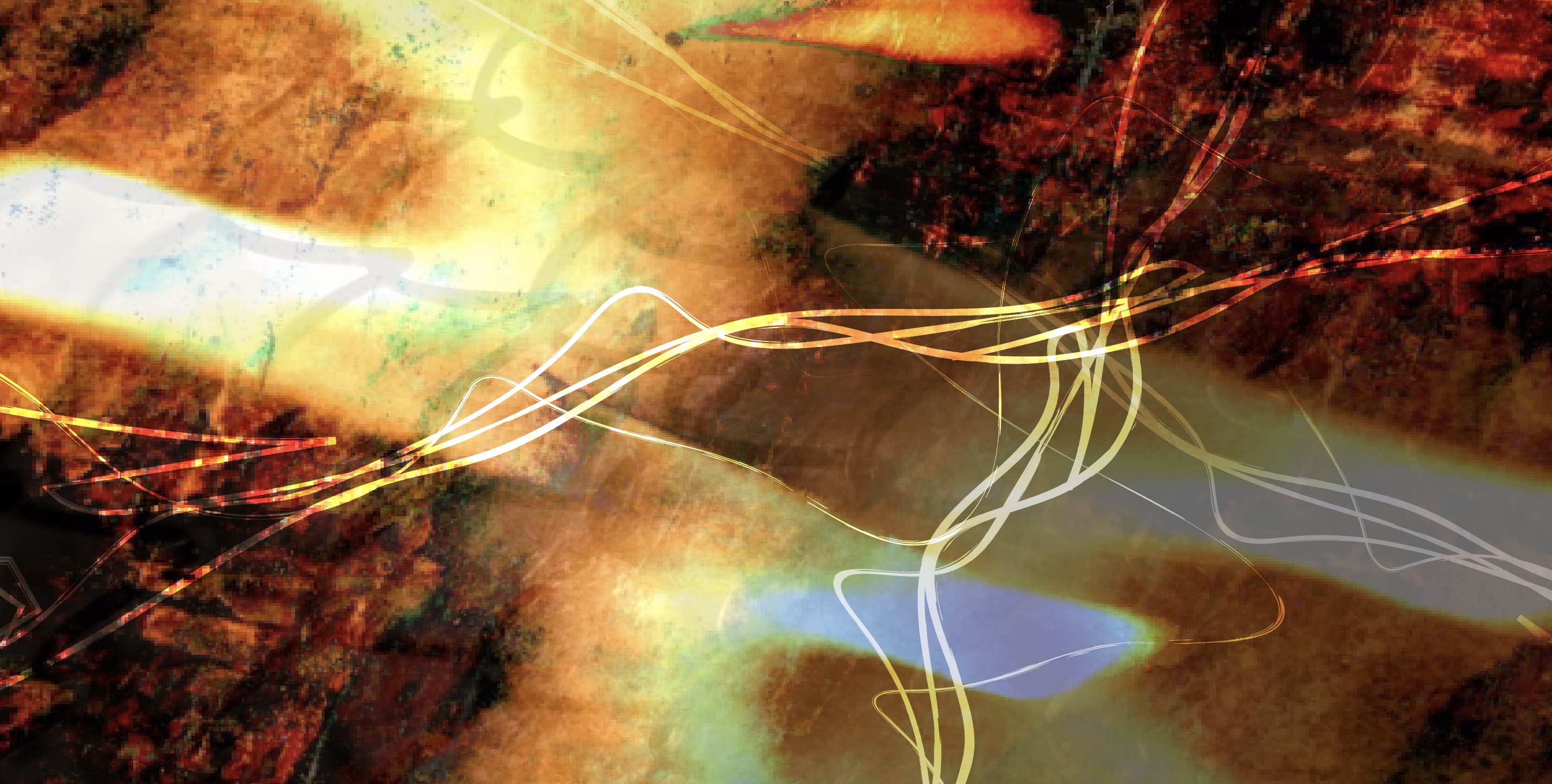
The vinyl, album, and CD covers for the rebrand of Radiohead’s A Moon Shaped pool drew inspiration from fire and the elements found in nature. Representative of a one’s journey through life with its winding twists and turns, the abstract components of the vinyl and album cover bring to light the underlying excitement and mystery present in the album.
winding twists and turns, the abstract components of the vinyl and album cover bring to light the underlying excitement and mystery present in the album.

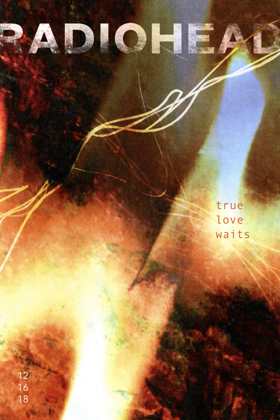
Poster Series
The poster series for Radiohead’s A Moon Shaped Pool highlighted the album release, as well as a featured song–True Love Waits. Inspired by the emotional depths of the album and uniqueness of the music, each of these posters feature different points of view of a burning fire. Digitally rendered to illustrate a varying viewpoint and perspective,
the flames burn in their own uniquely beautiful way, mysterious and yet inviting, complimenting the musical trance of Radiohead as a whole.


Rebrand Overview
Below is an overview of the entire Radiohead A Moon Shaped Pool rebrand. From the specially created visuals to the textured elements of the logo and typographic forms for the
album, this project encompassed many highs and lows throughout the process, much like the content of the album.
